 以Button组件为引
# 前言
Button是我们开发过程中使用频率非常高的组件,我们就以Button组件为引子,方便理解MSSUI的运作方式。
# 前置知识
开发Button组件之前,你需要了解 vue 的这些知识:
- 动态class (opens new window)
- 插槽 (opens new window)
- props通信 (opens new window)
- 插件 (opens new window)
- scss (opens new window)
- BEM命名规范 (opens new window)
简单介绍下上述的各个知识点。
# vue动态class
vue动态class常用的是对象语法和数组语法。
# 对象语法
# 数组语法
# vue插槽
Vue 实现了一套内容分发的 API,将 <slot>元素作为承载分发内容的出口。
# 默认插槽
定义slot-demo1组件,组件内部使用 默认插槽:
<template>
  <div class="slot-demo1">
    <slot></slot>
  </div>
</template>
<script>
export default {
  name: 'SlotDemo1',
}
</script>
2
3
4
5
6
7
8
9
10
然后使用这个组件:
<template>
  <div class="wapper">
    <slot-demo1>{{ message }}</slot-demo1>
  </div>
</template>
<script>
export default {
 data () {
   return {
     mssage: 'Hello World!'
   }
 }
}
</script>
2
3
4
5
6
7
8
9
10
11
12
13
14
slot-demo1组件内部的slot会被替换成Hello World。
# 具名插槽
定义slot-demo2组件,组件内部使用 具名插槽
<template>
  <div class="slot-demo2">
   <header>
    <slot name="header"></slot>
  </header>
  <footer>
    <slot name="footer"></slot>
  </footer>
  </div>
</template>
<script>
export default {
  name: 'SlotDemo2',
}
</script>
2
3
4
5
6
7
8
9
10
11
12
13
14
15
使用 具名插槽 时,应将插槽的name和实际展示内容一一对应
<template>
  <template #header>
    <h1>Here might be a page title</h1>
  </template>
  <template #footer>
    <p>Here's some contact info</p>
  </template>
</template>
2
3
4
5
6
7
8
# props通信
props 可以用 vue 父组件向子组件传值,最常用的是对象语法。
定义子组件
Vue.component('son', {
  props: {
    title: {
      type: String,
      default: ''
    }
  },
  template: '<h3>{{ title }}</h3>'
})
2
3
4
5
6
7
8
9
父组件中使用
<template>
  <son :title="title"></son>
</template>
<script>
  export default {
    data () {
      return {
        title: 'Hello World!'
      }
    }
  }
</script>
2
3
4
5
6
7
8
9
10
11
12
最后son组件中的title会被替换成Hello world!
# vue 插件
插件 通常用来为 vue 添加全局功能。
- 需要提供一个
install方法 - 全局方法
Vue.use注册插件 比如MSSUI导出时就提供了install方法
const MElement = {
  install: function (Vue, opts = {}) {
   // ...
  }
};
2
3
4
5
使用Vue.use注册:
import Vue from 'vue'
import App from './App.vue'
import MssUi from 'mssui'
import 'mssui/lib/theme-chalk/index.css'

Vue.use(MssUi)
Vue.config.productionTip = false

new Vue({
  render: h => h(App),
})
2
3
4
5
6
7
8
9
10
11
所以说,基于 vue 的UI库,其实都是作为 vue 的插件引入的。
# sass 和 scss
sass是高于CSS的一门元语言,它提供了更简洁、更优雅的语法老书写CSS样式。而scss是sass 3引入的新语法,在兼容sass之前用法的同时,拓展了sass,说白了,在scss中使用sass语法也是可以的。着重介绍下scss的基本用法,为了直观的理解scss和css之间的转换关系,可以使用官方提供的工具scss语法在线转换 (opens new window)进行测试。
# !global 和 !default 定义变量
$width: 100px !default; // 局部变量
$height: 100px !global; // 全局变量
.demo {
  width: $width; // 引用
  height: $height;
}
2
3
4
5
6
编译为
.demo {
  width: 100px;
  height: 100px;
}
2
3
4
# 使用&找到父容器
$width: 100px !default;
$color: red !default;

.parent {
  width: $width;
  & .son {
     color: $color;
  }
}
2
3
4
5
6
7
8
9
编译为
.parent {
  width: 100px;
}
.parent .son {
  color: red;
}
2
3
4
5
6
# 混入特性:mixin、include和content
@mixin定义混入指令函数,使用@include引用混入指令函数,content作为函数中中占位符,类似于Vue中的插槽。
@mixin h($color, $width) {
    width: $width;
    color: $color;
    & .m {
      @content
    }
}

.mixin-demo {
    @include h(red, 300px){
      font-size: 20px;
    };
    background: lightblue;
}
2
3
4
5
6
7
8
9
10
11
12
13
14
编译为
.mixin-demo {
  width: 300px;
  color: red;
  background: lightblue;
}
.mixin-demo .m {
  font-size: 20px;
}
2
3
4
5
6
7
8
当你给子元素定义样式,但是不想要父级的时候,可以使用@at-root跳出父级。
@mixin h($color, $width) {
    width: $width;
    color: $color;
    @at-root .m {
      @content
    }
}

.mixin-demo {
    @include h(red, 300px){
      font-size: 20px;
    };
}
2
3
4
5
6
7
8
9
10
11
12
13
编译为
.mixin-demo {
  width: 300px;
  color: red;
}
.m {
  font-size: 20px;
}
2
3
4
5
6
7
# 使用@function定义函数
@function getColor() {

    @return red
}

.func-demo {
 color: getColor(); // 直接调用
}
2
3
4
5
6
7
8
编译为
.func-demo {
  color: red;
}
2
3
这里只是抛砖引玉,scss还有很多强大的用法,比如@extend、支持四则运算等。
# BEM规范
当我们维护大型项目的时候,我们会发现维护CSS代码是一件很痛苦的事情,不同的开发者在命名css样式名的习惯上各不相同,这会给维护者造成很大的困扰。于是Yandex团队提出了BEM规范 (opens new window)。
- B 就是指块(block)
- E 就是指元素(element)
- M 就是指修饰符(modifier)
简单一点了来说,基本满足下面的范式就是BEM规范:
.block {}

.block__element {}

.block--modifier {}
2
3
4
5
6
解释一下:
- block 代表了更高级别的抽象或组件。
- block__element 代表 .block 的后代,用于形成一个完整的 .block 的整体。
- block--modifier 代表 .block 的不同状态或不同版本。
所以,
BEM规范只是提出一个命名的范式,但是具体在这个范式上面如何定义,仁者见仁,智者见智。
MSSUI中借鉴了ElmentUI中定义的BEM规范:
ml作为组件的命名空间 比如 ml-button、ml-alert- 双下划线
__作为块和元素的间隔, 比如ml-button__title - 双中划线
--作为块和修饰器 或 元素和修饰器 的间隔, 比如ml-form--inline - 中划线
-来作为 块|元素|修饰器 名称中多个单词的间隔 - 状态的前缀用
is, 比如是否button是否禁用,就是is-disabled
# 组件结构
在packages/button目录下定义两个文件:
├── index.js
└── main.vue
2
所有的组件,我们做这样的约定:
- index.js 用作提供
install方法,供Vue.use安装插件时调用 - main.vue 书写组件的结构
main.vue中定义基本的结构:
<template>
  <button
    class="ml-button"
    @click="handleClick"
    :disabled="buttonDisabled"
    :autofocus="autofocus"
    :type="nativeType"
    :class="[
      type ? 'ml-button--' + type : '',
    ]"
  >
    <i :class="icon" v-if="icon && !loading"></i>
    <span v-if="$slots.default"><slot></slot></span>
  </button>
</template>
<script>
export default {
  name: "MlButton",

  props: {
    type: {
      type: String,
      default: "default",
    },
    icon: {
      type: String,
      default: "",
    },
    loding: {
      type: String,
      default: ""
    }
  },

  computed: {
    buttonDisabled() {
      return this.disabled || this.loading;
    },
  },

  methods: {
    handleClick(event) {
      this.$emit("click", event, "这是Button组件");
    },
  },
};
</script>
2
3
4
5
6
7
8
9
10
11
12
13
14
15
16
17
18
19
20
21
22
23
24
25
26
27
28
29
30
31
32
33
34
35
36
37
38
39
40
41
42
43
44
45
46
47
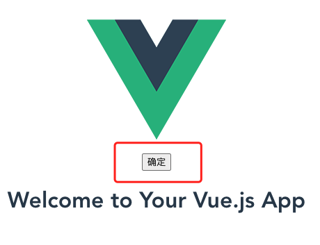
结构就不详细说明了,使用ElementUI的el-button的同学应该都能理解这个结构,毕竟按钮组件使用得很多。
# 组件样式
前文说到到scss和BEM规范,都是为了解释样式为何如下图这样组织:
├── common
│   └── var.scss
├── config
│   └── config.scss
├── fonts
│   ├── element-icons.ttf
│   └── element-icons.woff
├── mixins
├── index.scss
2
3
4
5
6
7
8
9
现在我们可以比较清晰的捋清为何这样组织样式了,每个文件的关系也就一目了然了。
common/var.scss, 存放定义全局通用的样式变量,比如通用的颜色变量:
$--color-primary: #409EFF !default;
$--color-white: #FFFFFF !default;
$--color-success: #67C23A !default;
$--color-warning: #E6A23C !default;
$--color-danger: #F56C6C !default;
$--color-info: #909399 !default;
$--color-text-primary: #303133 !default;
$--border-color-base: #DCDFE6 !default;
$--color-text-placeholder: #C0C4CC !default;
$--color-text-regular: #606266 !default;
$--color-black: #000000 !default;
$--color-success: #67C23A !default;
$--color-warning: #E6A23C !default;
$--color-danger: #F56C6C !default;
$--border-color-lighter: #EBEEF5 !default;
$--color-text-secondary: #909399 !default;
$--border-color-extra-light: #F2F6FC !default;
2
3
4
5
6
7
8
9
10
11
12
13
14
15
16
17
config/config.scss定义全局的配置,如BEM中使用到连接符和命名空间:
$namespace: 'ml';
$element-separator: '__';
$modifier-separator: '--';
$state-prefix: 'is-';
2
3
4
mixins中存放全局通用的混入指令函数,比如:
@mixin when($state) {
  @at-root {
    &.#{$state-prefix + $state} {
      @content;
    }
  }
}
2
3
4
5
6
7
fonts目录放置ElementUI提供的字体。还值得一提的是,scss文件中BEM规范的代码,并不是每个组件都去手动书写的,而是使用scss的函数特性,定义了b、e、m三个通用的函数自动生成。
b函数:
@mixin b($block) {
  $B: $namespace+'-'+$block !global;

  .#{$B} {
    @content;
  }
}
2
3
4
5
6
7
举个例子:
@include b (button) {
    width: 100px;
    height: 100px;
}
2
3
4
编译为
.ml-button {
  width: 100px;
  height: 100px;
}
2
3
4
e函数:
@mixin e($element) {
  $E: $element !global;
  $selector: &;
  $currentSelector: "";
  @each $unit in $element {
    $currentSelector: #{$currentSelector + "." + $B + $element-separator + $unit + ","};
  }

  @if hitAllSpecialNestRule($selector) {
    @at-root {
      #{$selector} {
        #{$currentSelector} {
          @content;
        }
      }
    }
  } @else {
    @at-root {
      #{$currentSelector} {
        @content;
      }
    }
  }
}
2
3
4
5
6
7
8
9
10
11
12
13
14
15
16
17
18
19
20
21
22
23
24
hitAllSpecialNestRule函数用来避免特殊的嵌套,比如样式名中带有--、is-、:的时候,就会命中规则。
@each in 类似于for in 循环遍历$element这个变量
举个例子:
@include b (button) {
    width: 100px;
    @include e(title) {
        color: red;
    }
}
2
3
4
5
6
编译为:
.ml-button {
  width: 100px;
}
.ml-button__title {
  color: red;
}
2
3
4
5
6
m函数:
@mixin m($modifier) {
  $selector: &;
  $currentSelector: "";
  @each $unit in $modifier {
    $currentSelector: #{$currentSelector + & + $modifier-separator + $unit + ","};
  }

  @at-root {
    #{$currentSelector} {
      @content;
    }
  }
}
2
3
4
5
6
7
8
9
10
11
12
13
举个例子:
@mixin m($modifier) {
  $selector: &;
  $currentSelector: "";
  @each $unit in $modifier {
    $currentSelector: #{$currentSelector + & + $modifier-separator + $unit + ","};
  }

  @at-root {
    #{$currentSelector} {
      @content;
    }
  }
}
2
3
4
5
6
7
8
9
10
11
12
13
button.scss
@import 'common/var.scss';
@import 'mixins/mixins.scss';

@include b(button) {
  display: inline-block;
  line-height: 1;
  white-space: nowrap;
  cursor: pointer;
  background: $--button-default-background-color;
  border: $--border-base;
  border-color: $--button-default-border-color;
  color: $--button-default-font-color;
  -webkit-appearance: none;
  text-align: center;
  box-sizing: border-box;
  outline: none;
  margin: 0;
  transition: .1s;
  font-weight: $--button-font-weight;
  & + & {
    margin-left: 10px;
  }
  @include m(primary) {
    @include button-variant($--button-primary-font-color, $--button-primary-background-color, $--button-primary-border-color);
  }
  @include m(success) {
    @include button-variant($--button-success-font-color, $--button-success-background-color, $--button-success-border-color);
  }
}
2
3
4
5
6
7
8
9
10
11
12
13
14
15
16
17
18
19
20
21
22
23
24
25
26
27
28
29
样式是直接借鉴的ElementUI的样式。
测试如下: